Sadly repulsed by the thought of food (so many leftovers went to waste...), I could only indulge in a purely cinematic fashion. In the same way that I'd go for some tasty stodge to get me through a nasty sniffle, I went for comfort-watching and opted to watch my old childhood sickday favourites- Tim Burton's Batman (1989) and Batman Returns (1991).
I make no secret of how much of a Batgeek I am- I have tickets to the live show in August- but I lost my faith once Joel Schumacher took over at the helm and pretty much laid waste to the series with the hyper-camp, neon Batman Forever and the...just...aaawwwwful... Batman & Robin. I was 10 when a film first made me want to leave the cinema. It's like realising that Santa isn't real- not all films you see in the cinema are wonderful like when you were a child. Still, my passion was reignited by continuing to watch the superior Batman: The Animated Series and later, Christopher Nolan's re-imagining of the series with Batman Begins and The Dark Knight.
Much has been made of how Nolan's efforts saw the transition of comic book films into real, legitimate cinema- no doubt largely in part to his reputation, skill and spot-on casting. For me though, there will only be one Batman who brings back childhood memories and reminds me of how much I loved it in the first place, and that's Michael Keaton. Apparently many people disagreed at the time due to Keaton's previous persona as a comic actor- when the casting was announced, Warner Bros. received 50,000 letters of complaint from comic book fans. In fact, it was so controversial that even Bob Kane (the CREATOR of Batman) himself protested against Keaton.
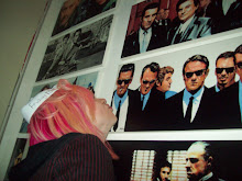
To be fair, you can see where they might have had a problem. Batman is the Dark Knight- a superhero who doesn't need superpowers; merely a mind-boggling array of gadgetry and sheer brute strength. According to the original script, Bruce Wayne was supposed to have "muscles on top of muscles and scarred from nightly combat".


 The top two pictures suggest a man who's clearly seen his share of action and knows his way around a workout room, whereas poor Michael Keaton looks sort of middle-management and has a distinct lack of chin. Not only that, but even when in Batsuit he's upstaged at every turn by his arch-nemeses (The Joker and The Penguin respectively), who camp it up with epic scenery-chewing turns that mean Batman is literally only there as a love interest for female leads and because... y'know... you need to have a good guy in it at some point.
It's this humanisation of villains that Bob Kane also sought to voice his concerns about, claiming that while Tim Burton had a 'great vision', he was too consumed with "characterization of the villains, and the scenic backgrounds, that at times he forgets about the story line". It's a complaint that has often been made of Burton; that's he's more of an outstanding set designer than a director. I find this ridiculous; in as much as his films are beautifully designed they also have alot of heart. His choice to cast Keaton was based on the fact that Batman should be an 'everyman'- after all, wouldn't Bruce Wayne's frequent disappearances from high society functions be kind of suspicious if he looked like he'd been hitting the 'roids?
Additionally, films such as the Superman series, Flash Gordon and even the original Adam West Batman series had been very cartoonish in style, with bright colours and all-American ideals. Burton's films offered more psychological depth, a darker edge and a grittiness that suggests that even superhero crime fighters have flaws. The emphasis in Batman on the Joker's performance is surely down to Jack Nicholson himself- a larger than life character, renowned for being a legendary actor in his own time. By the time Batman was released, he was practically a veteran. As for the sequel, well, Christopher Walken is the archetypal creepy-bad-guy... in order to give him a well-rounded part you have to get in depth with his character, and his character is bad. Simple as. As for the Penguin, his rise to fame and then notoriety is central to the basic plot of Batman Returns. It's almost like his origin story, only it skips out the first few years and catches the viewer up with them when he introduces himself to Gotham. How then, could you make a film about a villain's rise to power without giving him proper characterisation?
With regards to set design, there is no doubting Burton's skill and awe-inspiring (well, for me anyway) creative talent to imagine the most mind-bending worlds, beautifully and darkly realised. They fit the characters of his films, too. The town of Sleepy Hollow was actually built from the ground up, and the spooky, ominous mists surrounding the 19th century small town went perfectly hand in hand with the tone of Washington Irving's story. In the same way, the Gotham City of Batman and Batman Returns. The 1989 Batman was shot at Pinewood Studios, so as to escape the American press; and with a $5.5 million budget, production designer Anton Furst, together with Burton, mixed deliberately clashing styles of architecture to make Gotham City as ugly and bleak a 'Metropolis' as had ever been seen.
 ^^ The Gotham City set at Pinewood Studios
The most obvious influence for Gotham City is Fritz Lang's Metropolis, with the stark industrialist sets lending a bleak and ironic play on the film's title. Also, there are remnants of Ridley Scott's Blade Runner, as well as the original concept sketches by Bob Kane himself. This is a world where you can really believe that crooks and villains would fester and flourish, to wreak havoc on the honest, hardworking folks. I found a quote from Furst which for me really conjured up an image of the thought process and logic behind the designs. He stated, "I thought we'd go back to the turn of the century; and imagine what New York might have become had there been no planning permission, and no concern about the quality of life for people in the city". There is absolutely nothing computer generated about this version of Gotham, which appeals to everything I love about the idea of creating sets and designing new worlds. You can almost imagine a sort of hi-tech, modern day Gangs of New York version of the city, or one which doesn't look dissimilar to Ichabod Crane's New York in Sleepy Hollow.
The sequel follows similarly, but is more expansive- the inspiration here was Fascist, World's Fair and Russian architecture, with a healthy dose of German Expressionism thrown in for good measure. The mix of styles really pulls together well. Since this film involves the story of the Penguin, it shows a Gotham that exists not only in skyscrapers and the streets but way below ground too. Here though, Furst was replaced by Bo Welch whom Burton collaborated with on Beetlejuice and Edward Scissorhands. The similarities to Burton's other work is more obvious with Batman Returns than the original, and it has alot more of a 'quirkiness' to it befitting of his usual style. With all of the painstaking effort made to deliver a world so uniquely and perfectly realised, it's easy to laud Burton for being so concerned with the look of the film. But it's this look which gives the films their haunting and poetic tone befitting of the characters and storylines. Just look what happens when the colour palette is amped up and everything is spray painted neon...
 Pictured above- the death of childhood.
Everything that I loved about the original Batman films came down to the dark heart of it all, which was ripped out by the third and fourth 'efforts'. Burton gave us the wide-eyed Vicki Vale and the sultry Selena Kyle; Joel Schumacher gave us Nicole 'everything she says sounds like she's out of breath' Kidman- who, really, was just a poor man's Kim Basinger- and frumpy dumpy Alicia Silverstone, who hit her peak in two Aerosmith videos and Clueless, and should've stayed there. But I'm digressing, so I'll get back to the point.
Some things may change as you get older- things you like, things you don't, what inspires you or what doesn't. It's only when you go back and look at things in a different, or more 'grown up' way, that you fully appreciate the things you loved when all you had was childlike wonder. Looking into the films in a more (I hate to say it cuz it sounds so pretentious) 'specialised' way really did give me a greater appreciation for them. Being able to recognise influences, to know how they fought against adverse fan-reactions and understanding the profound impact they had on similiar films of the genre just compounds everything I love about Batman, and indeed Tim Burton, and only adds to the experience I had watching it as a wee yin. I love that I can watch these films when I'm feeling rubbish and ill and want something comfortably familiar, or alternatively if I'm feeling like watching something stimulating and hugely influential to me.
In saying that, I will add that there's one thing Christopher Nolan had that Burton didn't... any ideas what it could be.....?